Portfolio
Case study 01
Hospitality
Investigating and enhancing digital table management tools for high-stakes restaurant services.
Role
Lead UX Designer & Researcher
Timeline
8 weeks / February 2026
Tools
Figma
Scope
eCornell UX Certification / Academic Portfolio

Phase 01
Context & The Challenge
A critical drop-off problem hiding in plain sight
Project Overview
Restaurant staff struggle to pace service using digital management tools during peak hours. I investigated the operational impact of platforms like ResyOS and OpenTable under high-stakes conditions.
Initial Research Hypothesis
Fragmented communication during service creates high stress for hosts and disrupts guest flow. Streamlining internal communications will improve service quality, reduce burnout, and increase restaurant revenue.
Design Problem Statement
Restaurant staff need a way to overcome fragmented communication during high-intensity shifts to prevent interpersonal tension and a drop in service quality.
Primary KPI goal
Reduce host table-assignment time by 75% to eliminate front-door bottlenecks and ease cognitive load under pressure.
Phase 02
Discovery & Empathize
Understanding the emotional reality of service – contextual interviews
I conducted a Contextual Inquiry with restaurant hosts and managers to investigate how high-stakes service environments impact interaction with digital table management systems.

Research methods
5 participants
Moderated contextual interviews
8 clusters
Affinity diagram
Persona synthesis
Background, Goals, Behaviors
Core user pain points
From 5 Contextual Inquiries
01
Inflexible System Limitations
Systems fail to accommodate custom seating requests or server rotation rules, forcing hosts to manually bypass the software.
02
Unreliable Real-Time Updates
Delayed floor status updates force hosts to rely on manual walkthroughs and memory during peak rush hours.
03
Organizational Friction
Hosts struggle to balance guest preferences with turnaround efficiency, often compounded by management overrides.
Phase 03 & 04
Define & Ideate
Turning research noise into a single, guiding design question
How Might We
How Might We help restaurant staff overcome fragmented communication during high-intensity shifts in order to reduce burnout and improve service quality?
While I initially hypothesized that service issues stemmed from outdated UI, affinity clustering revealed structural system failures that leave staff in cognitive disarray during peak hours.
Concept convergence
Ideation Process
Eight early directions were tested and narrowed into one service awareness concept unifying communication, seating, and guest status.
01
Dynamic Team Communication Hub
02
Seat Assigning Assistant
03
Real-time Guest Status Alerts
04
Peak Hours Focus Mode
05
Gamified Mentorship & Feedback Tracker
06
Pre-shift Preparation Checklist
07
Real-time Conflict Resolution Tips
08
Emotional Decompression Moments
Unified direction
Real-time Service Awareness System
A shared layer unifying communication, seating, and guest status into one calm service view
Phase 05 & 06
Design, Prototype & Test
Two rounds of testing. Both changed the design evoultion.
Moderated paper testing with 2 fine-dining hosts revealed structural usability issues, directly shaping layout adjustments for the high-fidelity digital prototype.
Iteration 01
Tap-outside overlay dismissal
Testing insight
Users under high cognitive load struggled to locate the small ‘x’ close button. I updated the interface to allow background canvas taps to dismiss overlays, eliminating unnecessary friction during fast-paced service.
Iteration 02
Waitlist time headers
Testing insight
Adding clear column headers to the waitlist eliminated confusion over whether times indicated elapsed wait or remaining estimates, removing mental math during peak shifts.


Iteration 03
Persistent Search & Quick-Filter Toggles
Testing insight
Implmenting persistent search bars and filter toggles to the main view eliminated navigation delays, allowing hosts to isolate table statuses instantly without losing their floor context.
2
Usability rounds
Moderated
2
Total participants
1 per round
15
Tasks observed
Across all sessions
12
Insights synthesised
Tagged in Google Documents
Phase 07
Impact & Key Takeaways
Results: Smarter Seating
The streamlined interface surface key details when needed, using visual guardrails to prevent seating mistakes and eliminate front-door chaos.
Unified Service View
Integrated communication, live seating, and guest status into one workspace.
Accidental Double-Bookings
Visual guardrails built directly into the flow stop errors before they happen
Critical Pain Points Resolved
Structural logic failures across 8 operational clusters resolved to ease cognitive load.
Waitlist Status Clarity
Explicit time headers show wait states instantly, eliminating peak-hour mental math.

HIGH-RESOLUTION PROTOTYPE
Prototype Showcase
A direct showcase of the two highest-impact feature integrations — each card pairs the shipped interface state with the functional design decision behind it.
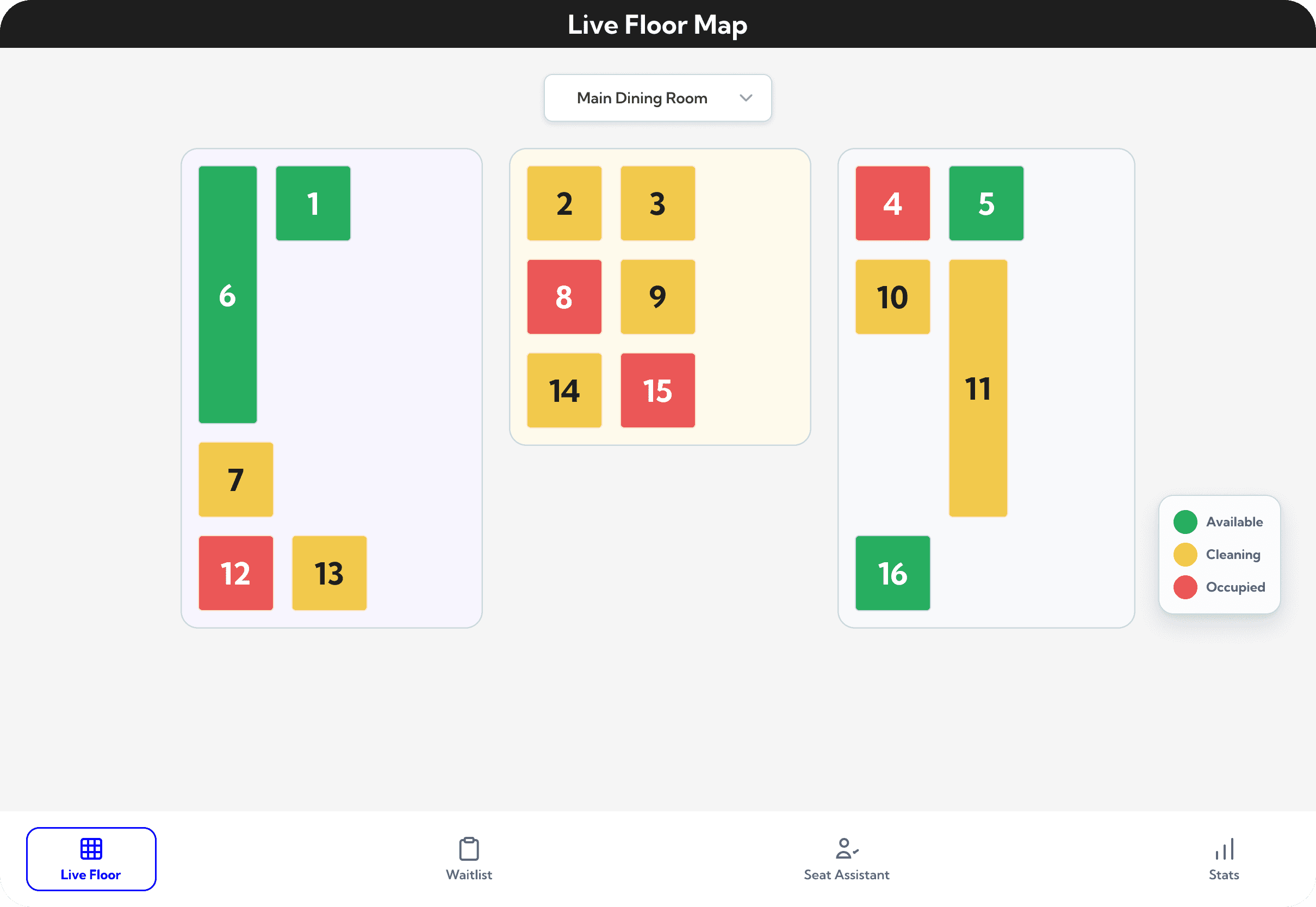
Live Floor Map (Foundational & High Priority)
Uses the Principle of Proximity to group tables into clear server sections, preventing bottlenecks. Status is communicated instantly via visual hierarchy, allowing hosts to check availability at a glance without mental math.

Server Load Transparency View
(High Priority & Supporting Justification)
Gives hosts an immediate view of active server rosters and table availability, equipping them with transparent proof to confidently assign sections and keep the front door moving without second-guessing.
What I’d carry into the next project
01
Value First, Rules Second
Clear steps and meaningful labels show users where they stand, turning chaotic shifts into structured workflows.
02
Progress Keeps People Calm
Visual feedback and transparent status indicators reduce cognitive load and anxiety for staff during high-intensity peak hours.
03
Clear Layouts Prevent Errors
Minimal clutter combined with simple visual guardrails gives staff confidence to act quickly under pressure.
© 2026 Streett Jacobs — All rights reserved